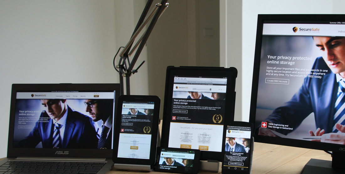
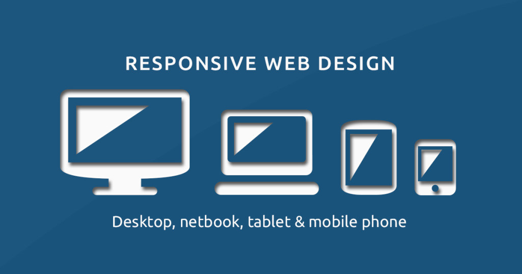
Responsive Web Design is the new in right now. The hottest new phrase in web design and SEO is responsive design. Although not for everyone RWD will have a significant effect on methods of information consumption on internet and it’s here to stay. It is simply a way to make sure that your website is easily view able on a variety of devices of different sizes. This can be achieved through stacking of elements.
There are millions of smart mobile devices that are activated on daily basis all of them having the capability to access internet. Thus, it wouldn’t be wrong to assume that the activity of internet consumption is becoming a primarily a mobile activity. Explosion of mobile devices on the front is accompanied by the confusion of creating separate website for each of the different screen sizes, frames, form factors and resolutions.

Responsive Web Design is a buzzword which promises to save the web designers from the dicey situation. Simply put, it opposes the concept of separate mobile, pc versions or tablets of your site instead it assists in creating a website that adapts to the screen size on which it is being accessed making the entire content visible in readable way.
Designing a website is an important part of any company’s online marketing campaign; it’s indeed interesting to note the effect of responsive web design on SEO.
Designing a website is an important part of any company’s online marketing campaign; it’s indeed interesting to note the effect of responsive web design on SEO.

There are some of the important reasons to consider responsive design when you are considering the SEO of your website:-
1. Google considers it as best practice – When we talk about SEO, it’s important to know and follow what Google says. What it says goes because it has the largest market share of search engines. Google recently stated it as the best practice which means if you have both a mobile version and a regular website you will be ranked lower than someone who has a responsive design. In terms of SEO it should help your site gain better rankings over a site that separately has regular version as all links is channeled into a single URL instead of splitting it into two different ones.
2. Improves the bounce rate – main focus is to improve user experience and readability of the page while viewing it on different mobile devices. If a site looks good, performs satisfactorily and behaves well, users will stay on it for long time thereby increasing its bounce rate which in any case is a good thing for your site and it’s Search Engine Optimization (SEO).
4. Saves on SEO Efforts, Time and Cost – anyone who has worked superficially on SEO will tell you that it’s a time consuming process that also involves financial resources. Doing all your SEO efforts again for your mobile site doesn’t make sense. Optimizing one site is tough, let alone trying to do the same for two. When you opt for a responsive web design, it works for SEO on desktop site and will also apply to the mobile version of your site. This also applies to troublesome link building process. The entire link portfolio you build for the main site will also apply to your mobile site.
5. Avoids Duplicate Content – You risk placing some duplicate content on one of the sites by creating two sites for the same business. Even changing your whole content will eat up your time and money. With same content placed at two different sites, you could drive the visitor to the wrong version of the site. Webmasters who replicate the content of their desktop website on their mobile version also run the risk of damaging the credibility of the mobile site from search engine’s perspective. Applying responsive design mitigates this type of risky behavior.
6. Easy Updating – updating will be a two course process which is annoying and can also result in messing up of the SEO of your main site, if you have two separate sites. However there’s only one site to be updated with responsive design and hence less chance to make significant mistakes.
Source Url:- http://surevin.com/blog/reasonswhy-responsive-web-design-is-good-for-seo/
